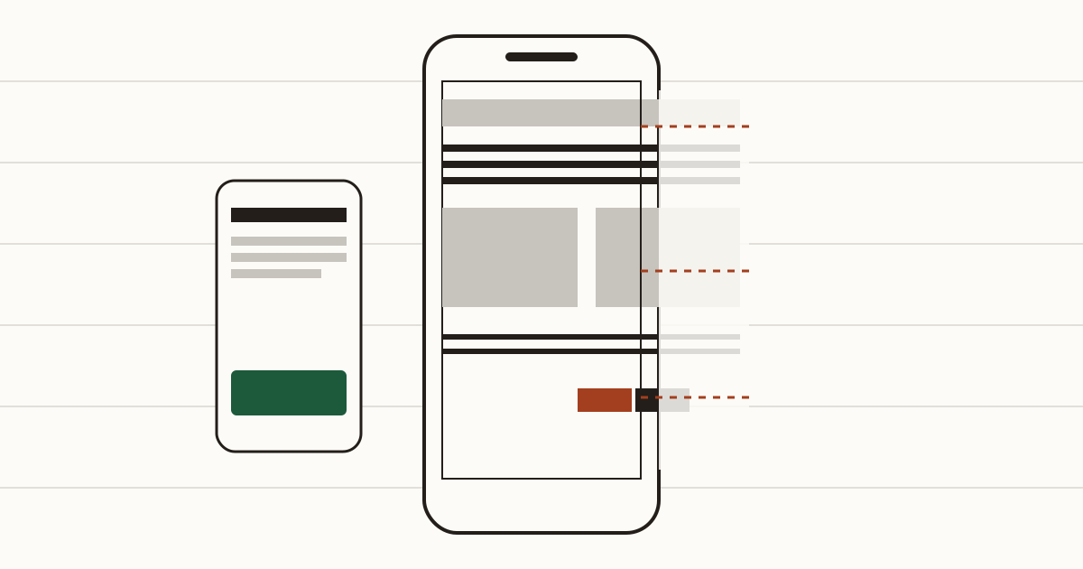
It's raining, the bus is late, and someone's decided this is the moment to book a haircut. They find your salon and open the site. What loads is a tiny copy of the desktop page. They pinch and scroll sideways. Then they aim for "Book" and hit "Prices" beside it. Then the bus pulls in. They'll book somewhere else tonight, and you'll never know they tried.
We're Cents Security. We check business websites from the outside and price each problem we find in pounds lost a month. The phone version is where a surprising share of those pounds goes missing.
Why the phone version is the one that matters
For a salon or a takeaway, a lot of visits happen in a queue or between appointments. Usually that's on mobile data, with one hand free. You'll see national figures quoted for how many people browse that way. Ignore them. Open your own analytics, pick the last three months and look at the split by device, because a dentist's audience and a wedding venue's behave differently.
If phones turn out to be half your visits or more, then the version you check on your laptop is the one most customers never see. That's the moment we'd stop judging the site from the desk.
The problems that send people away
None of these looks serious on a big monitor. On a small screen, with a thumb and a bit of impatience, any one of them can end the visit before the booking starts.
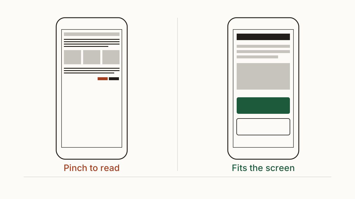
Text you have to pinch to read
The page arrives shrunk, with a text size nobody can read without zooming, and once they zoom the layout runs off the side. The usual cause is one missing line in the page's code, the viewport meta tag. It tells the phone to fit the page to its own width instead of pretending it's a desktop monitor.
Adding the line takes minutes. An older theme might need more work after that, because its layout was never built to narrow. And when the page is heavy too, you've got a slow website on top of a cramped one, which gives people two reasons to leave. There's more on that in our piece on a slow website.
A phone number you can't tap
Someone wants to ring you. On most phones that should be one tap. If your number sits inside an image, or it's plain text that isn't set up as a call link, they have to remember it and type it into the dialler themselves. Plenty won't. Your developer fixes it by wrapping the number in a "tel:" link.
Buttons too small or too close together
"Book now" squeezed against "Prices" means thumbs land on the wrong one. Do that twice and people give up. Buttons need room around them, and the booking button should be the easiest thing on the screen to hit.
A page that won't let people zoom
Some sites switch zoom off on purpose so the layout stays tidy. It shuts out anyone who needs bigger text, and the WCAG accessibility guidelines ask for text that can be enlarged. We flag it on every scan, because the fix is deleting a few characters from one tag.
What it costs you
We'd rather show you the sum than hand you a figure. You need three inputs: phone visits a month, the share of those visitors who'd normally book, and what a booking is worth. Say a salon gets 600 phone visits, 3% book, and a cut is about £35. That's around 18 bookings and roughly £630 a month arriving from phones. These are example numbers, not yours.
Now suppose a fiddly booking button turns away one booking in ten. That's about two a month, near £70. If it turns away a third, it's six, around £210. Nobody can measure that share from outside, so we show every input next to the figure and you can swap in your own.
Check it yourself in five minutes
Take your own phone, switch wifi off and open your home page. Can you read it without zooming? Now book something, with one thumb, all the way to the confirmation screen. Tap your phone number and see whether it dials.
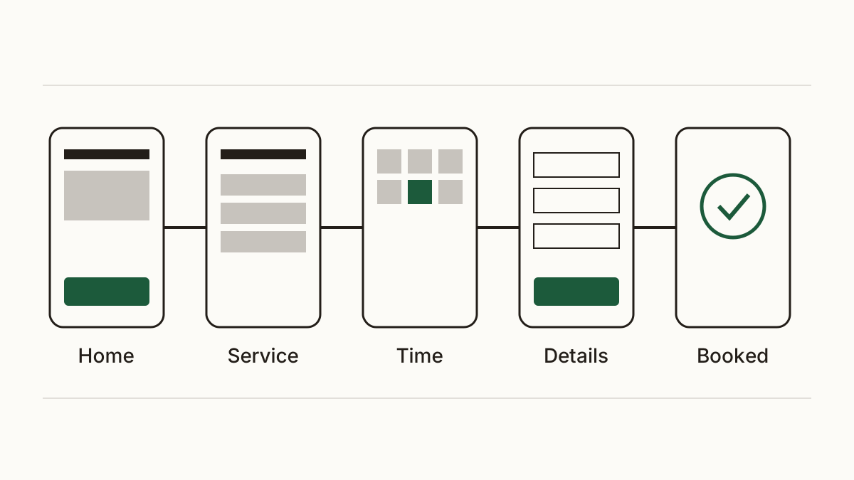
Then borrow a friend's older phone, the smaller the better, and run the same test. That's where a mobile friendly website and one that only works on the owner's new handset part ways. If you'd like to see what we look at when we run it for you, here's a full list of what we check.
Who fixes each one, and what to send them
Most of this is your web developer's job, or yours if you built the site on a page builder. Send them the page address and a screenshot of how it looks on a phone, with the problem circled. Say which phone you used, because a fault that shows on a small older handset can hide on theirs. The blocked zoom needs one sentence: "please remove user-scalable=no and any maximum-scale below 5 from the page header so people can zoom".
Owners often expect this to mean a rebuild. It rarely does. A mobile friendly website is mostly a short list of small fixes like these, and a developer can usually clear them in an afternoon.
FAQ
Do I need a separate mobile site or an app?
No. One site whose layout adjusts to the screen is the normal approach now, and it's what we'd recommend. An app only pays when customers come back every week, and even then the website has to work first.
Does Google rank a site lower if it doesn't work on a phone?
It can. Google says it mainly looks at the mobile version of your pages when deciding rankings. A mobile friendly website won't put you top by itself, but a broken one gives Google and your customers a reason to pick someone else.
Check your website with us and see what each problem costs you a month.