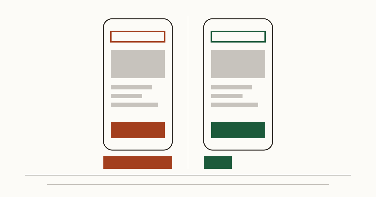
A dentist hears from reception that a regular patient has moved to the practice down the road. Nobody complained. The patient searched, looked at two sites on a phone during a lunch break, and booked with the other one. So the dentist opens the competitor's website that evening and wonders what it does better. It's a fair question. And it has a fairly concrete answer once you stop looking at the photos and start counting problems.
Why the comparison is worth an afternoon
Your customers already compare you. They do it in the same search results, usually on a phone, often in under a minute, and they don't tell you which way it went. You only see the result: a quieter diary, a few more gaps on a Tuesday.
We'd rather you saw that comparison the way they do. A problem you share with every practice in town costs you little against them, because the patient meets it everywhere and shrugs. A problem only you have is different. That one sends people next door, and it's the one worth fixing first. An afternoon is usually enough to find it.
What a customer notices first
The first thing is the address bar. If Chrome shows "Not secure" on your booking page and not on theirs, plenty of people leave before they read a word. Next comes speed: a page that stays blank for several seconds on mobile data loses the impatient visitors, and on a bus or in a car park most visitors are impatient.
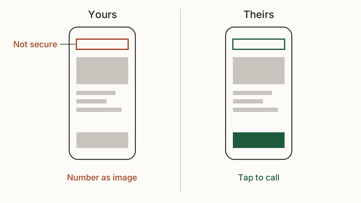
Then the small things that decide a booking. Can they tap your phone number, or is it an image of a number they have to copy out by hand? Are your opening hours on the page, or buried in a PDF that won't open on a phone? Picture someone standing outside at ten past five, wondering if you're still open. Their site answers that in one glance. Yours makes them guess. People who have to guess tend to ring the one that answered.
What search engines and assistants notice
Google and the assistants that answer for you never see your design. They read your page titles, your descriptions and the structured data that says "this is a dental practice, here are the hours, here's the address". If your title reads "Home" and theirs reads "Family dentist in Leeds", you've lost before anyone clicks.
The bigger miss is a page that can't be read at all. Some sites block crawlers by mistake, often with a setting left switched on after a redesign. Others only fill in their text after a script runs, so a crawler sees an empty page. Then you don't rank lower. You don't appear, and an assistant asked for a dentist nearby names the practice it could read.
How to compare two websites fairly
A fair website comparison takes a little discipline, or it turns into an argument about colours. You can do it by hand with two browser tabs and a notepad, or check two websites at once and get both lists side by side, with the same checks run on each.
Same kind of page, same device
Compare their booking page with your booking page, on a phone, not their homepage with your contact page on a laptop. Most of your visitors arrive on mobile, so that's the test that counts. Use mobile data rather than the office wifi if you can.
Ignore looks, count problems
A nicer font doesn't win patients. A working "Book now" button does. When you compare two websites, write down what's broken, missing or slow on each, and leave taste out of it. Their site may look dated and still beat yours on every point a customer feels. A plain site with one page of text can keep customers that a glossy one loses.
Turning the gap into money
Every problem they have fixed and you have not is customers you lose to them. To put a price on it, you need a few inputs: roughly how many visitors you get a month, what share of them a problem drives away, and what a customer is worth to you. A new patient at a dental practice is worth far more than a single coffee at a café, so the same fault costs very different amounts on the two sites.
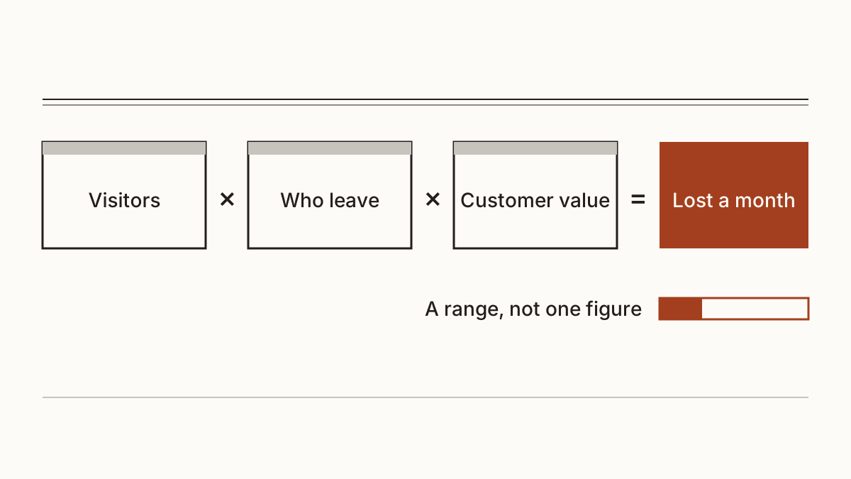
We don't invent those shares. Cents Security, our scanner, prices both sites as the same assumed business, so the gap comes from the problems and not from guesses about size. Every figure is a range, and you can read what each figure rests on, with its source, then swap in your own numbers if yours differ.
What to do with the result
Start with the problems that only you have and that cost most each month. That's your fix list, in order. The warning in the address bar is usually your web host's job, often an hour's work once they look at it. A missing title or the phone number as an image is a job for whoever edits your site. Slow pages tend to need your developer, and they're worth a proper quote.
We write each finding with the fix for your kind of site and a short message you can forward to that person, so you don't have to translate it yourself. Then run the comparison again a month later and see whether the gap closed.
FAQ
Is it legal to check a competitor's website?
Looking at what their site shows any visitor is what every customer does. Our check of a competitor's website only makes the requests a browser or a search engine already makes, and we don't save their report. We don't give legal advice, so for anything beyond looking, ask your solicitor.
What if their website is worse than mine?
Then we'll say so. A comparison that always found you losing would be a sales pitch, not a measurement. You'll still see the problems you share, and they're worth fixing too, because the next practice to open may not have them.
Check your website with us and see what each problem on it costs you a month.